

Desk bookingModern workplaceWorkspace management
7 design hacks for your workspace booking floor plans
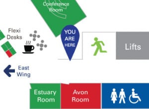
Many workspace booking systems offer the ability to book and locate a workspace via an interactive floor plan.
An interactive floor plan typically comprises a series of graphics depicting your office layout floor by floor (or area by area), overlaid with an intelligent and dynamic booking element that uses ‘hot spots’ and colour coding to show free/busy status, along with pinch and zoom, point and click interaction.
Many systems also support the ability to book a socially distanced desk. Some systems can even identify the location of co-workers that have booked desks on the same day, enabling you to book a desk that’s close by for optimum collaboration.
In short, floor plans are a great way of doing things, as they give your workforce at-a-glance visibility of what workspaces are available on the day they want to come into the office, and where the workspace is located. I for one, am keen to find a desk that’s close to vital services, such as the coffee area, printers and the loos!
Regardless of which booking system you select – or even if you simply want to use printed maps in your reception/lobby areas – here’s some top tips on how to create the best floor plan graphics to use as the basis of your workspace booking system:
What’s in this article:
1. Put yourself in the shoes of the observer
2. De-clutter (don’t just use a default CAD diagram)
3. Be prepared to re-draw your CAD floor plan from scratch
4. Don’t be afraid to use artistic licence
5. Pick up on design cues & use colour to ease navigation
6. You may need to review numbering & naming conventions
7. Include Covid-related signage
Conclusion – It’s Worth Putting in the Effort
1. Put yourself in the shoes of the observer
Before uploading a map into your system, check it’s the right (and logical) way up.
A key thing to bear in mind is that conventions for orienting a map or architectural diagram can vary.
For static ‘geographical’ maps, north is always up. If you’re depicting objects like buildings, the convention should be to show the main entrance of the building at ‘the bottom’ of the map, regardless to where north is. Plans for new builds, however, can tend to follow a ‘north equals up’ convention.
Another consideration is context.
If your booking system is to be displayed on a big screen in your main reception, then our best practice guideline is to create a ‘heads up’ experience for the viewer.
By this I mean, if meeting room ‘A’ is shown on the left of the floor plan, the room itself should be physically ‘off to the left’ of the screen it’s displayed on.

Covid has, however, changed the whole ‘touch screen in reception’ experience.
Now, given that most bookings will be made remotely from home or from a mobile device, the best strategy is to orient your floor plan according to the most typical ‘end user experience’ of entering the office.
This means orientating the map with the main entrance at the bottom of the screen (and clearly labelling any other entrances – e.g. Car Park Entrance).
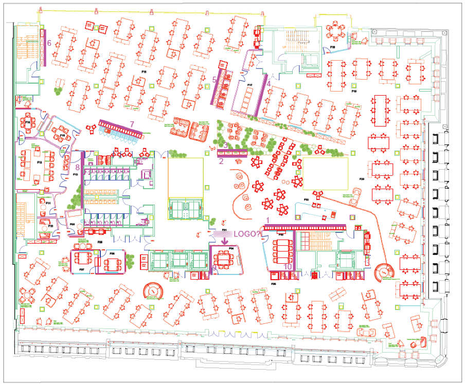
2. De-clutter (don’t just use a default CAD diagram)
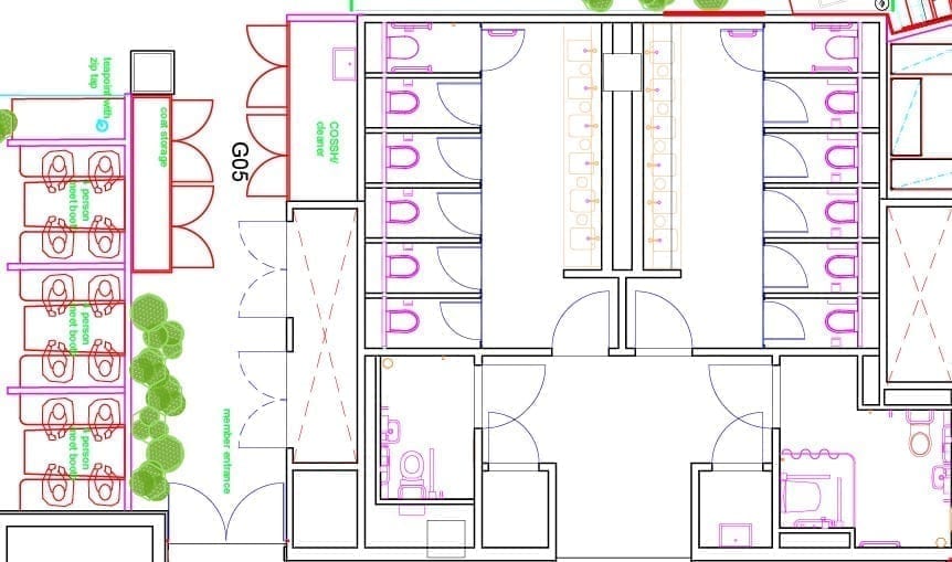
CAD diagrams of your office are great for the facilities team as they show details of cabling and plumbing and provide accurate measurements for occupation planning and so on.
Showing the detail of every stall in the loos and every stick of office furniture is too much information when you just want to book a desk.
Tips for simplifying your maps are:
Focus on just the basics. Drop the details and leave behind just the components that will help your workforce select, and then later find, their chosen workspace. This means paring it back to:
- The basic office shape
- Entrances & exits
- Lifts & staircases
- Desks & numbering*
- Storage for personal effects (important where staff no longer have a dedicated desk)
- Meeting rooms & names*
- Coffee areas (everyone knows where these are)
- Loos (ditto)
- Copying/scanning equipment
- Recycling points
- Accessibility
- Features & attributes of the desk, such as:
- Standing desk
- Docking station
- Multiple screens
- Likewise, facilities available in a meeting room, such as:
- VC equipment
- Flip chart
- Smartboards
Strip away the detail using your CAD package. It may be possible to go back to the originator of your CAD drawings and get them to ‘turn off’ the layers of detail you don’t need, and just leave you with the elements that are required for the job in hand. Refer to this article for an example of how to achieve this in AutoCAD
Use icons where possible. Instead of drawing every cubicle in the loos, just put the relevant symbols in place. And there’s no need for a legend if your chosen symbols are recognisable.
3. Be prepared to re-draw your CAD floor plan from scratch
Our top tip here is to be prepared to re-draw your optimal floor plans from scratch, using your CAD diagrams as a guide.
Why?
Often access to the original CAD application and drawings is difficult. Although you may have a PDF version of the CAD diagram, being able to access the individual layers and disable them is either a) impossible or b) can take an inordinate length of time.
Another reality is that you may only have access to a rough copy of an original CAD diagram that’s been copied, scribbled on and re-drawn several times over.
Below is typical of what we might be given to work with.
In this case the client didn’t have access to the original CAD diagrams and many ad-hoc changes had been made over time anyway.
The resolution was poor and you’ll notice that the main entrance to the building is depicted at the top of the diagram, so the map actually needed to be rotated by 180 degrees and recreated from scratch in order to be legible and make logical sense to the viewer.
By redrawing your maps you will benefit from:
- A clearer visual for staff
- A much smaller file size that will render quickly and cleanly on any browser or mobile device
Scalable vector graphic (SVG) files in particular are very efficient file formats to work with and enable rapid zooming in and out without loss of resolution. Even if your chosen workspace booking platform works with jpgs, we recommend creating your original graphic in a vector diagramming application as this will make it easy to go back and make any amendments in the future.
Tips for creating your vector graphic floor plans are:
- Use a vector diagramming package such as Adobe Illustrator or Inkscape (available free online)
- Start with an initial page size/format that matches in with your typical viewer’s device.
- If this is the desktop, then start with 1920×1080
- If this is a mobile display, start with 414×896
- Import any existing floor plan graphic you have as a starting point
- Scale it on the page to be a large as possible
- ‘Lock it in place’
- Start ‘tracing’ over your floor plan, adding just the basics**
- Use copy and paste, step and repeat to build up key components, like blocks of desks.
You’ll quickly build up a floor, and then with a bit of luck, you’ll have similar layouts that repeat from floor to floor. At the very least, the building footprint, stairs, lifts and WCs are often in the same location across all floors in a building!
Before:
After:

4. Don’t be afraid to use artistic licence
Just like the award-winning design for the London Underground map, helping your workforce choose and find a workspace does not demand a slavishly accurate rendition of your actual floor plan.
Believe me, individuals will NOT be out with their tape measure with a view to calling you out on a discrepancy of real-life VS your electronic floor plans.
For this reason, you may wish to employ the following techniques to aid visibility:
- If your default layout is landscape in format, but your building is long and skinny, simply make it ‘wider’ than it is in reality. This will allow you to use larger proportions for workspaces and labels.
- Reduce the size of insignificant features like a long connecting corridor
5. Pick up on design cues & use colour to ease navigation
If there is a strong design element to your office, then reflect this in your diagrams to aid familiarity.
For example, we have depicted such navigation ‘aids’ as:
- Reflecting the different coloured carpets used in each zone.
- Labelling ‘external landmarks’ (for example, a customer in Canary Wharf wanted to help staff navigate by depicting the view out of each window (HSBC, O2, etc)
- Picking up on décor such as different coloured meeting rooms
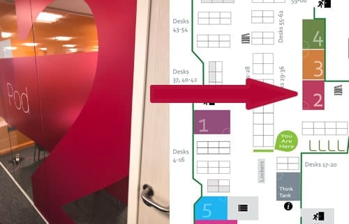
Ultimately, we always recommend you reflect any corporate colours and fonts that reinforce your company brand.
TIPS
- Avoid over-use of the colours red and green. Red, green (and often amber) are the colours that are typically used to show the free/busy status of workspaces on your floor plan. It’s therefore a good idea to avoid use of these colours to avoid confusion.
- Avoid design by committee. Whilst it’s a good idea to get input from the various different stakeholders in your company, reflecting everyone’s views in the design process can result in a lack of simplicity.
6. You may need to review numbering and naming conventions
This subject is a whole new conversation again. Bear in mind that the labels on CAD diagrams may not relate to actual meeting room names in use. Also many of the customers we work with that are implementing desk booking systems don’t already have a desk numbering system.
Once you have devised your optimal desk numbering system, you’ll need to individually number each workspace, but you don’t necessarily need to apply a number to each desk shown on the interactive map.
Covid-secure workspace booking
Are you planning a ‘Covid-secure’ workspace booking system? Here’s 4 top tips when it comes to how you go about identifying your Covid-secure desks.
7. Include Covid-related signage
Your workspace booking floor plans are a great opportunity for you to reinforce your Covid-secure messaging and precautions to provide reassurance to your workforce.
In addition to any built-in Covid secure capability your booking system has, such as automatically blocking off adjacent desks when you make a booking, consider adding the following:
- Traffic flow signage
- Hand sanitising stations
- Departmental zones
- Cleaning stations & contact points

Other capabilities you should look for in a Covid-secure workspace booking solution include:
- Self-certification of staff members when they book workspaces
- Authenticated (yet contactless) check-in (this will allow you to track exactly who’s used what workspace)
- The scheduling of between-use cleaning
- Policies that govern who can book what spaces when (and how often) – the subject of our next blog
- Capture of information to support contact tracing
- Registration of visitors and safety instructions
Conclusion – It’s Worth Putting in the Effort
Making your office floor plans clear, informative and great looking will be a good investment on your part:
- By helping staff members choose and book their optimal workspace, that’s near the resources they need and has the attributes they desire, they will be as productive as possible when they’re in the office.
- It will allow you to demonstrate the precautions you are taking to keep your workforce safe and help put minds at ease as they return to the office.
- It’s a very visible service, and as we get back to the ‘new normal’, may be seen by visitors to your office – not just your own workforce. Done well, it will convey a slick and professional image for all concerned.